 Tom Jin
Walk into your store right now. Stand at the entrance. Look at the first thing a customer sees.
Is it a clearance rack? A cluttered endcap? A wall of product that says nothing?
Now think about what that customer does next. Do they turn right? Left? Wander aimlessly? Most retail owners have never mapped the actual path a customer takes through their store. They arrange shelves based on what fits, stack products where there is space, and hope the checkout line does the rest.
Here's the thing: your floor plan is costing you real money every single day. Industry research consistently shows that strategic store layouts increase average transaction value by $4 to $8 per customer. For a store doing 150 transactions a day, that is $600 to $1,200 in daily revenue you are leaving on the floor — literally.
Over a year, that is $219,000 in lost revenue from a problem you can fix in a weekend with some planning and a tape measure.
This guide walks you through the science behind retail store layout — from the moment a customer crosses your threshold to the moment they tap their card at checkout. Every section is backed by measurable impact, not theory.
The Decompression Zone: The First 15 Feet Nobody Shops
The biggest layout mistake in retail? Putting your best products right at the entrance.
The first 5 to 15 feet inside your door is called the decompression zone. Customers are adjusting — to the lighting, the temperature, the sounds, the visual complexity. According to retail industry data, shoppers walk through this area without registering anything. Signs placed here get ignored. Products displayed here get walked past.
But it gets worse: a cluttered decompression zone actually slows customers down psychologically, creating a subconscious resistance to entering the store fully. A clean, open entry does the opposite — it pulls people in.
What to do: Keep the first 10 to 15 feet open and welcoming. No product displays. No sale signs. Use this space to transition customers from the outside world into your store environment. A subtle speed bump — a small table display or a change in flooring texture — placed just past the decompression zone signals the brain to slow down and start looking.
That is where your first high-impact display goes. Not at the door — five steps past it.
The Right Turn: Why 90% of Your Customers Go the Same Direction
Here is a pattern interrupt that will change how you think about your store forever.
Research across thousands of retail environments shows that roughly 90% of customers naturally turn right when they enter a store. Right-handed people (about 90% of the population) instinctively favor the right side. This is not a suggestion — it is a near-universal behavior.
That first wall on the right? Retailers call it the power wall. It is the single most valuable piece of real estate in your entire store.
And that's not all: customers who encounter a strong, curated display on the power wall spend more time in the store and visit more departments than those who encounter generic shelving. The power wall sets the tone for the entire shopping experience.
What belongs on the power wall:
- New arrivals and seasonal collections (creates urgency and freshness)
- Highest-margin products (not necessarily highest-priced)
- Visually striking displays that photograph well (your customers are your marketers)
- Products that tell a story — origin, craftsmanship, limited edition
What does not belong on the power wall: clearance items, everyday basics, or anything that says "we are desperate to move this." Save the discount rack for the back left — the area customers are least likely to visit naturally.
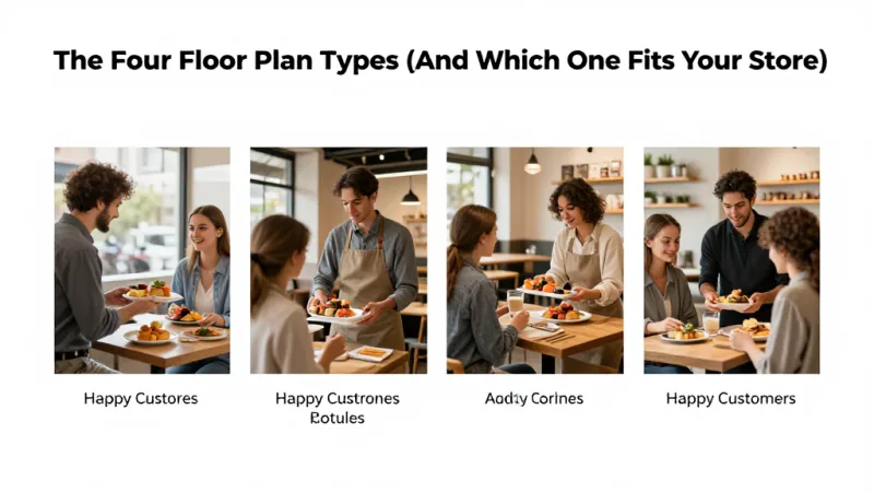
The Four Floor Plan Types (And Which One Fits Your Store)
Every retail layout falls into one of four categories. The right choice depends on your store size, product type, and customer behavior.
1. Grid Layout
Long, parallel aisles with products on both sides. Think grocery stores, pharmacies, and convenience stores. The grid maximizes product density and makes it easy for customers to find specific items.
Best for: stores where customers come with a specific purchase in mind, high-SKU environments (500+ products), and stores under 3,000 square feet that need maximum shelf space.
Revenue impact: Grid layouts generate the highest sales per square foot because every inch is sellable. But they produce lower average transaction values because customers tend to grab what they need and leave.
2. Loop (Racetrack) Layout
A defined path that leads customers through every department in a continuous loop. IKEA made this famous, but it works at any scale. The main aisle creates a natural circuit, with departments branching off to the sides.
Best for: stores between 2,000 and 10,000 square feet, retailers who want every customer to see every department, and stores with distinct product categories.
Revenue impact: Loop layouts produce the highest average transaction values because customers are exposed to more products. Industry data suggests loop layouts increase impulse purchases by 20% to 30% compared to grid layouts.
3. Free-Flow Layout
No defined aisles or paths. Products are displayed on tables, stands, and wall fixtures in a curated, boutique style. Customers wander freely, discovering products organically.
Best for: boutiques, specialty retailers, stores under 2,000 square feet, and high-margin businesses where the experience is part of the product.
Revenue impact: Free-flow layouts keep customers in the store longest and create the strongest emotional connection to products. They sacrifice product density for experience, so they work best when margins are high enough to justify fewer SKUs per square foot.
4. Herringbone Layout
Short, angled aisles branching off a central corridor. Common in hardware stores, wine shops, and narrow retail spaces where a standard grid would feel claustrophobic.
Best for: narrow or irregularly shaped spaces, stores with heavy foot traffic and limited width, and retailers who need grid-style density in a smaller footprint.
Here's the thing: most successful stores combine elements from multiple layouts. A boutique might use free-flow for apparel and a grid section for accessories. A pet store might use a loop to guide customers past food, toys, and grooming, with grid aisles within each department. The key is intentional design, not default arrangement.
Speed Bumps: Strategic Interruptions That Increase Dwell Time
Dwell time is the single strongest predictor of purchase size. A customer who spends 20 minutes in your store will spend roughly twice as much as a customer who spends 10 minutes. The math is straightforward — more time means more products seen, more products considered, and more products purchased.
Speed bumps are intentional disruptions in the shopping path that cause customers to pause, look, and engage:
- Feature tables — A waist-height table in the middle of a pathway, displaying a curated selection of 6 to 10 items. Customers walk around it, and the act of navigating creates engagement.
- Cross-merchandising displays — Place complementary products together outside their normal departments. A wine display next to cheese. Phone cases next to the phone charger aisle. Gift bags next to the gift card rack.
- Sensory triggers — Scent diffusers, music changes between zones, lighting shifts, and texture changes in flooring all signal the brain that something new is happening and trigger attention.
- Interactive elements — Product testers, touchscreens with product information, or a self-service kiosk where customers can check inventory or sign up for your loyalty program all create natural pause points.
But it gets worse if you have zero speed bumps: customers entering a store with long, uninterrupted sightlines tend to walk faster, see less, and leave sooner. A straight shot from the door to the back wall is a revenue killer.
The Checkout Zone: Where $4 Items Become $4,000 in Monthly Revenue
The checkout zone — the area within arm's reach of your register — is the most profitable square footage in your store. Customers standing in line are a captive audience. They have already decided to buy. Their wallet is literally in their hand.
Products placed at checkout sell at rates far above their normal shelf velocity. The key constraints: items should be priced under $15, sized small enough to grab without thought, and relevant to a broad customer base.
High-performing checkout items by store type:
- Apparel boutique: jewelry, accessories, socks, travel-size fragrance, gift cards
- Pet store: treats, waste bags, collar charms, e-gift cards
- Hardware store: batteries, tape measures, work gloves, lip balm, gift cards
- Specialty food: candy, small sauces, recipe cards, gift cards
Notice the pattern? Gift cards and e-gift cards belong at every checkout. A customer buying a birthday present might not think to grab a gift card — unless it is right there at the register. A POS system that supports both physical and digital gift cards — with instant email delivery for e-gift cards — captures sales that would otherwise walk out the door.
And that's not all: the checkout zone is also where you capture loyalty sign-ups. A customer-facing display at the register showing "Join our rewards program — earn points on today's purchase" converts at significantly higher rates than any in-aisle signage. The customer is already buying. The friction is at its lowest. The perceived value is at its highest.
Diva Nail Beauty uses this exact approach across their 4 locations — a customer-facing display at checkout prompts loyalty enrollment while the POS automatically tracks commission for the serving technician. The result: 90% efficiency increase and a loyalty capture rate that turned first-time visitors into regulars.
Traffic Flow Analysis: Use Your POS Data, Not Guesswork
Most retailers rearrange their stores based on gut feeling. "The back corner feels dead, let me move the sale rack there." That is like rearranging deck chairs without knowing which side of the ship is sinking.
Your POS system already contains the data you need to make layout decisions:
- Market basket analysis — Which products are purchased together? If 40% of customers who buy running shoes also buy athletic socks, those products should be within 10 feet of each other.
- Sales velocity by category — Which departments generate the most revenue per square foot? High-velocity categories deserve more prominent placement.
- Time-of-day patterns — Do morning customers buy differently than afternoon customers? If so, consider moveable displays that change throughout the day.
- Transaction size by entry point — If your store has multiple entrances, POS data (correlated with terminal location) can reveal which entry produces higher-spending customers.
A processor-agnostic POS like KwickOS gives you the transaction data and the flexibility to act on it. Because you are not locked into a single payment processor's reporting dashboard, you can export, analyze, and cross-reference your sales data with layout experiments — measuring before-and-after impact on the same products in different locations.
T. Jin China Diner uses this data-driven approach across 15 locations and 75 terminals. When POS data revealed that a specific appetizer sold 3x more when displayed on the counter near checkout versus listed only on the menu, they rolled the change across all locations in one click. Same product, same price — 3x the sales from a placement change.
The Dead Zone: Resurrecting the Back-Left Corner
If 90% of customers turn right at the entrance, the back-left corner of your store is where products go to die. It is the least-trafficked area in almost every retail environment.

But you still pay rent on those square feet. Here is how to make them productive:
- Destination placement — Put a product category that customers specifically seek out (like restrooms, fitting rooms, or a popular brand) in the dead zone. The destination pulls traffic into an area that otherwise gets ignored.
- Experience zones — Create a reason to visit. A tasting station, a demo area, a selfie wall, or a digital signage display showing product videos can transform a dead corner into a destination.
- Clearance with purpose — The back-left is the right place for clearance, but present it properly. A well-organized clearance section pulls bargain hunters deep into the store, and they pass full-price merchandise on the way.
Checkout Flow: The Last 60 Seconds That Determine Lifetime Value
The checkout experience is not just about speed — it is about what happens in the final 60 seconds of a customer's visit. This is where you turn a transaction into a relationship.
A modern POS checkout flow should accomplish five things in under 90 seconds:
- Process payment seamlessly — tap, chip, or swipe with no fumbling. KwickOS processes locally at 1ms latency, which means zero lag between tap and confirmation. Even if your internet drops, the hybrid local+cloud architecture keeps checkout running.
- Prompt for loyalty — "Are you a member? Would you like to join?" A points-based loyalty program that starts customers with bonus points at enrollment converts dramatically better than starting from zero.
- Suggest gift cards — The cashier or the customer-facing display asks: "Would you like to add a gift card today?" This single prompt, asked at every transaction, can generate thousands in additional monthly revenue.
- Capture contact info — Email receipt delivery doubles as opt-in for marketing. The customer gets convenience; you get a direct communication channel.
- Close with warmth — A genuine farewell with eye contact. The peak-end rule says the last moment disproportionately shapes the overall memory. A great goodbye means a return visit.
Rockin' Rolls Sushi Express installed 49 iPad self-ordering stations across 3 locations — and discovered that the checkout screen's "Add a gift card for someone special?" prompt generated more gift card sales than any physical display. The digital prompt appeared at the exact moment of highest purchase intent.
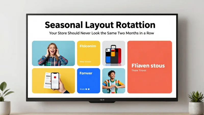
Seasonal Layout Rotation: Your Store Should Never Look the Same Two Months in a Row
Customers who visit your store regularly develop "store blindness" — they stop seeing displays they have walked past 10 times. Rotating your layout seasonally (or even monthly) re-engages returning customers and increases their dwell time.
You do not need to redesign the entire store. Move three things:
- The power wall display — Rotate monthly. New arrivals, seasonal themes, or curated collections keep the highest-traffic wall fresh.
- Feature tables — Change weekly if possible. These are your speed bumps, and stale speed bumps lose their stopping power.
- Checkout impulse items — Rotate seasonally. Sunscreen in summer, hand warmers in winter, gift cards during the six-week holiday window when nearly half of all annual gift card sales happen.
Your POS system should track the velocity of every product in every position, so you can measure the impact of each rotation. Products that spike after a move stay in the new position. Products that do not respond get swapped again.
Multi-Location Layout Consistency
If you operate more than one location, layout consistency becomes a competitive advantage. Customers who visit your second location should feel immediately oriented — the power wall is in the same relative position, the checkout is familiar, and the flow feels natural.
Crafty Crab Seafood manages this across 19 locations with 152 terminals by using a centralized management dashboard. When a layout-related product placement change is tested and validated at one location, it rolls out to all 19 with synchronized inventory and menu updates. The POS ensures that every location has the right products in the right categories, matching the physical layout to the digital catalog.
This level of consistency is only possible when your POS platform supports multi-location synchronization — something locked-in systems like Toast or Square struggle with at scale. KwickOS was built for exactly this use case, with centralized controls that let you manage product categories, pricing, and promotions across every location from a single dashboard.
Measuring Layout ROI: The Before-and-After Test
Every layout change should be measured. Here is the simplest framework:
- Baseline: Record average transaction value, transactions per day, and revenue per square foot for 2 weeks before making changes.
- Change: Implement one layout change at a time (move the power wall display, add a speed bump, reorganize checkout).
- Measure: Record the same metrics for 2 weeks after the change.
- Compare: Calculate the dollar impact. If moving your gift card display from a back shelf to the checkout zone increased gift card sales by $800/month, that change is worth $9,600/year — from a 15-minute move.
Use our retail profit margin calculator to model how layout-driven increases in average transaction value compound across your annual revenue. A $4.50 increase per customer across 150 daily transactions is $246,375 in additional annual revenue. That is not a rounding error — that is a new employee, a second location's down payment, or the savings from switching to a processor-agnostic POS that saves you another $3,000 to $8,000 per year in processing fees alone.
Your Layout Is a Revenue Lever — Pull It
KwickOS gives you the transaction data, multi-location sync, and checkout tools to turn layout changes into measurable revenue. Gift cards, loyalty prompts, customer-facing displays — all built in.
Get a Free Demo