 Tom Jin
Walk into any McDonald's. Red walls. Yellow arches. Orange accents. Walk into any Whole Foods. Green everywhere. Earth tones. Natural wood.
Now ask yourself: is that a coincidence?
It is not. Those companies spent millions testing which colors make people hungry, which colors make people trust a brand, and which colors make people pull out their wallets faster. And the research is clear — color influences up to 90% of a customer's snap judgment about your business, according to restaurant industry data.
Here's the thing: you do not need a million-dollar research budget to use the same science. You just need to understand the rules — and apply them to every surface your customers see, from your walls to your menu to your POS checkout screen.
After 20 years running restaurants and building technology for 5,000+ businesses across 50 states, I have watched color choices make or break first impressions hundreds of times. This guide gives you the science, the specific colors, and the exact places to apply them.
The Science: Why Color Affects What (and How Much) People Eat
Color perception is not subjective opinion — it is a measurable neurological response. When your eyes register a color, your brain triggers physiological reactions before you are consciously aware of them.
Red increases heart rate and stimulates appetite. Orange triggers feelings of warmth and comfort. Blue suppresses hunger (your brain associates it with mold and poison in nature — very few foods are naturally blue). Green signals freshness and health. Yellow grabs attention and creates a sense of urgency.
But it gets worse. These reactions are not just about appetite. They affect how long customers stay, how much they spend per visit, and whether they come back.
Industry research on restaurant environments shows that warm-colored interiors (reds, oranges, warm lighting) increase table turnover by encouraging faster eating. Customers in warm-toned environments tend to eat quicker and leave sooner — which means more covers per night in a fast-casual or QSR environment. Cool-toned interiors (blues, greens, dim lighting) slow customers down, encouraging them to linger, order another drink, and add dessert — exactly what fine-dining operators want.
The takeaway is this: there are no universally "good" or "bad" restaurant colors. There are colors that match your business model and colors that fight against it.
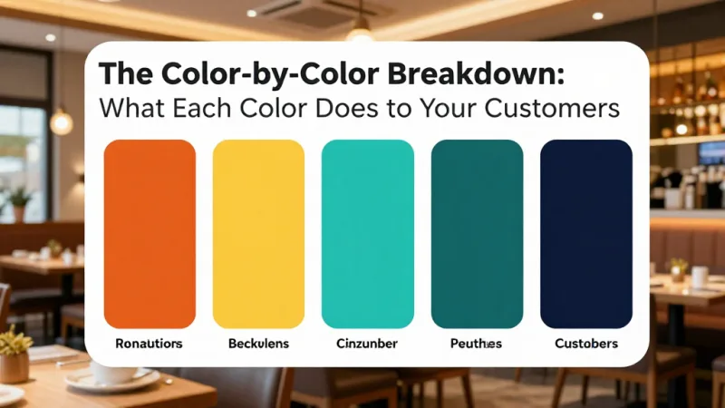
The Color-by-Color Breakdown: What Each Color Does to Your Customers
Red: The Appetite Trigger
Red is the most powerful color in food marketing. It increases heart rate, creates a sense of urgency, and stimulates appetite. McDonald's, Wendy's, KFC, Popeyes, Chick-fil-A, Five Guys, In-N-Out — the list of red-dominant fast-food brands is not a coincidence.
Use red when you want customers to act fast: order quickly, eat quickly, leave quickly. It works for quick-service, fast-casual, and take-out heavy concepts. But use it sparingly in fine-dining — too much red creates anxiety, not relaxation.
Where to apply it: accent walls, menu item highlights, call-to-action buttons on your online ordering page, "Order Now" prompts on self-ordering kiosks, and limited-time offer graphics on digital signage.
Orange: Warmth and Impulse
Orange combines the energy of red with the friendliness of yellow. It stimulates appetite, creates feelings of warmth, and — critically — triggers impulse decisions. Industry data suggests orange "Add to Cart" buttons outperform other colors in food ordering contexts.
And that's not all: orange is the color of comfort food. Think Dunkin', Howard Johnson's, Hooters. It tells customers "this place is fun, approachable, and the food will make you happy."
Where to apply it: modifier and upsell prompts on your POS checkout screen, "Add a Side" buttons on kiosks, dessert menu sections, and gift card promotional displays.
Yellow: Attention and Happiness
Yellow is the most visible color in the spectrum. Your eye processes it faster than any other color. That is why caution signs, taxis, and golden arches use it — it demands attention.
In restaurants, yellow creates feelings of cheerfulness and energy. It works exceptionally well for breakfast and brunch concepts (think Waffle House, Denny's). But too much yellow creates anxiety. Use it as an accent, not a wall color.
Where to apply it: exterior signage, menu item callouts (especially limited-time offers), loyalty program enrollment prompts, and "points earned" notifications in your CRM and loyalty system.
Green: Health, Freshness, and Trust
Green tells customers "this is natural, this is fresh, this is good for you." It is the go-to color for health-conscious brands (Sweetgreen, Whole Foods, Panera's salad visuals) and works well for farm-to-table, organic, and plant-based concepts.
Green also communicates financial value and eco-consciousness. If your brand emphasizes sustainability, local sourcing, or organic ingredients, green reinforces that message before you say a single word.
Where to apply it: menu backgrounds for healthy options, packaging for takeout/delivery, environmental messaging on digital signage, and e-gift card designs for health-conscious promotions.
Blue: The Double-Edged Sword
Blue suppresses appetite. Full stop. Very few natural foods are blue, so your brain does not associate it with eating. This is why almost no food brands use blue as their primary color.
But here is where it gets interesting. Blue works brilliantly for seafood restaurants (ocean association = freshness), bar and cocktail lounges (cool sophistication), and tech-forward brands (trust and reliability).
Blue also conveys trust and professionalism. If your restaurant needs to communicate reliability and consistency — say, a corporate catering operation or a franchise brand — blue builds that confidence.
Where to apply it: very selectively. Seafood restaurant interiors, cocktail bar lighting, corporate catering marketing materials, and loyalty program branding where trust is the primary message.
Black and Dark Tones: Luxury and Exclusivity
Black menus, dark walls, moody lighting — these are the signatures of high-end dining. Black communicates exclusivity, sophistication, and premium quality. It tells customers "this meal is an experience, not just fuel."
Restaurants using dark color schemes typically see higher check averages. Customers in dark, upscale environments feel they are in a "special" setting and are psychologically primed to spend more — on wine pairings, tasting menus, and premium add-ons.
Where to apply it: menu design, website, interior walls and furnishings, high-end gift card packaging, and VIP membership tier branding.
5 Places You Are Probably Ignoring Color (And Losing Money)
Most restaurant owners think about color for their walls and logo. But customers encounter your brand colors in a dozen other places — and inconsistency kills the psychological effect.
1. Your POS Checkout Screen
The last thing every customer sees before paying is your checkout screen. If your POS locks you into a generic interface with no brand customization, you are missing the final impression.
KwickOS allows operators to customize the checkout interface, customer-facing display, and tip screen with brand colors. When Tiger Sugar's two locations use their signature yellow-black palette on the self-ordering kiosks, the brand experience does not stop at the counter — it carries through the entire checkout flow.
2. Your Digital Menu Boards
Static menus on paper give you one chance to get colors right. Digital menu boards let you test and iterate — change background colors, highlight different items, and run time-based color shifts (warm tones for lunch rush, cool tones for evening service).
Shogun Japanese Hibachi customized their KDS station displays with color-coded routing — red for grill station, blue for sushi bar, green for cold appetizers. Kitchen staff process orders faster because the color tells them where the ticket goes before they read a single word.
3. Your Online Ordering Page
Your online ordering page is a digital storefront. If it uses generic white-and-gray templates while your physical restaurant uses warm reds and oranges, you are creating a brand disconnect that reduces conversion.
Your online ordering site should match your physical brand colors. Red "Add to Cart" buttons. Orange modifier prompts. Your logo colors in the header. And your brand palette on the order confirmation page, gift card purchase flow, and loyalty sign-up form.
4. Your Gift Cards and Loyalty Materials
Physical and e-gift cards are one of the few branded items customers carry in their wallets. A well-designed gift card with your brand colors becomes a pocket-sized billboard.
The same applies to loyalty program materials. When your loyalty program uses consistent brand colors across the enrollment prompt, the points notification, the reward redemption screen, and the tier-upgrade animation — customers build a stronger emotional connection with your brand. According to restaurant industry data, branded loyalty programs see redemption rates that can far exceed generic white-label programs.
5. Your Exterior and Signage
You have approximately 3 seconds to catch a passing driver's attention. Your exterior color choices determine whether they slow down or drive past.
High-contrast color combinations (red on white, yellow on black, white on dark green) are more legible from a distance than low-contrast pairings. And your exterior colors should match what customers see inside — a jarring color shift from outside to inside creates subconscious discomfort.
Color Strategy by Restaurant Type: A Quick-Reference Guide
| Restaurant Type | Primary Colors | Accent Colors | Why It Works |
|---|---|---|---|
| Fast Food / QSR | Red, Yellow | White, Orange | Appetite + urgency + speed |
| Fast Casual | Orange, Warm Brown | Green, Cream | Comfort + quality perception |
| Fine Dining | Black, Deep Burgundy | Gold, Cream | Luxury + exclusivity |
| Seafood | Blue, White | Sand, Coral | Ocean freshness + trust |
| Health / Organic | Green, Earth Tones | White, Light Brown | Natural + wholesome |
| Bubble Tea / Dessert | Pastel Pink, Purple | Yellow, Mint | Fun + youth + Instagram appeal |
| BBQ / Smokehouse | Dark Red, Black | Amber, Tan | Fire + smoke + authenticity |
| Coffee Shop | Brown, Cream | Green, Gold | Warmth + richness + craft |
The Multi-Location Color Consistency Problem
Here is where color psychology breaks down for growing brands: consistency across locations.
When Crafty Crab Seafood expanded to 19 locations with 152 terminals, every new location needed identical brand presentation — same menu colors, same digital signage templates, same kiosk interfaces, same online ordering appearance. One franchise location using slightly different blue tones on their menu board can undermine the brand trust built across all other locations.
This is where centralized technology matters more than most operators realize. A platform that lets you push brand-consistent templates — digital signage designs, kiosk layouts, online ordering themes — to every location from a single dashboard eliminates the "rogue location" color problem. T. Jin China Diner manages 15 stores and 75 terminals from one central system, ensuring brand consistency without visiting each location.
And here's the part that most POS vendors do not tell you: if your system is cloud-only with no local fallback, a connectivity issue at one location means customers see a loading screen instead of your carefully designed brand colors. KwickOS uses a hybrid local+cloud architecture with 1ms local latency, so your branded interfaces — digital menus, kiosks, checkout screens — render instantly from local storage, whether the internet is up or down.
Testing Color Changes Without a $50,000 Renovation
You do not need to repaint your restaurant to test color psychology. Start with the surfaces you can change for free or near-free:
- Digital menu boards. Change background colors and item highlight colors weekly. Track which combinations drive higher sales on specific items. This costs nothing if your signage system is POS-integrated.
- Online ordering page. A/B test button colors. Red vs. orange "Add to Cart." Green vs. yellow "Complete Order." Track conversion rates and average order value per variation.
- Gift card and loyalty designs. Run seasonal color themes on your e-gift cards — red and gold for holidays, pastels for spring, warm oranges for fall. Track which designs generate the most gift card sales and membership sign-ups.
- Printed menus. Before committing to a full reprint, test a single color change — highlight boxes, section dividers, or price typography — on one page of your menu. Compare item sales before and after.
- Lighting. Warm bulbs (2700K) create an orange-amber environment. Cool bulbs (5000K+) create a blue-white environment. Swapping bulbs costs under $50 and can dramatically shift the color perception of your entire dining room.
The key is measurement. Without your POS tracking item-level sales by daypart, you are guessing. With it, you can correlate color changes to revenue changes with precision.
What Your Competitors Get Wrong About Color
The biggest mistake I see? Restaurant owners copying successful brands without understanding why those brands chose their colors.
A fine-dining steakhouse painting their walls McDonald's red because "red increases appetite" misses the point entirely. Red increases appetite and decreases dwell time. A steakhouse charging $65 per entree needs customers to stay, order wine, add dessert. The appetite stimulation is real, but the speed-up effect destroys the higher-margin experience.
The second mistake: ignoring the checkout experience. You can have the perfect interior color scheme and still hand customers a generic white-and-gray payment screen that feels like paying a utility bill. The POS checkout, the tip prompt, the "join our loyalty program" screen, the receipt — these are all branded touchpoints. A processor-agnostic POS like KwickOS lets you customize these screens and choose any payment processor, saving $3,000 to $8,000 per year in processing fees on top of the branding benefit.
The third mistake: forgetting about staff perception. Your employees spend 8+ hours a day in your color environment. Restaurant industry research suggests warm-toned staff areas increase energy and tempo, while cool-toned break rooms help with rest and recovery. Colors affect your team's performance, not just your customers' appetites.
Your Color Psychology Action Plan
Do not overthink this. Start with three steps:
- Audit your current colors. Walk through every customer touchpoint — exterior, entrance, dining room, menu, digital screens, kiosks, POS checkout, online ordering page, gift cards, loyalty materials, packaging. Write down every color you see. Look for inconsistencies.
- Match colors to your business model. Use the quick-reference table above. If your concept is fast-casual but your interior looks like a law office, you have a mismatch. If your fine-dining restaurant has the same red-and-yellow energy as a burger chain, you have a mismatch.
- Start testing where it is cheapest. Digital signage, online ordering, and POS screen customization cost nothing to change. Make one color adjustment, measure the impact for two weeks, and iterate.
Color is not decoration. It is a revenue strategy. The restaurants that treat it as one — from their walls to their checkout screens to their e-gift cards — build brands that customers recognize, trust, and return to.
Build a Brand Customers Remember
KwickOS gives you full control over your digital touchpoints — POS screens, kiosks, digital signage, online ordering, and loyalty programs — so your brand colors show up everywhere your customers look. See how 5,000+ businesses build consistent brand experiences.
Get a Free Demo