 Kelly Ho
Walk into your restaurant right now and look up at your menu board. How long has that printed poster been there? Six months? A year? Since you opened?
Now think about what that static board can't do. It can't show a customer a photo of your new seasonal special. It can't switch from breakfast to lunch pricing at exactly 11:00 AM. It can't hide the brisket sandwich when you sell out at 1:30 PM. And it definitely can't gently nudge a customer from a $7.50 regular combo to a $10.99 premium combo with an animated photo that makes the upgrade look irresistible.
Here's the thing: your competitors' digital boards are doing all of that. And according to restaurant industry data, those animated screens are driving 15-23% higher average order values compared to static printed menus.
On a restaurant processing 200 transactions per day with a $14 average check, that 23% lift translates to roughly $18,000 in additional annual revenue — from a screen that costs less than $1,200 to set up.
But it gets worse: most restaurants that do have digital menu boards are using them wrong. They're running slideshow presentations with clip-art text, 47 items crammed onto a single screen, and animations so fast they give customers motion sickness instead of appetite.
This guide covers the design principles, layout templates, animation rules, and daypart strategies that separate menu boards that sell from menu boards that just glow.
Why Digital Menu Boards Work: The Psychology of Motion and Choice
Before you design a single screen, you need to understand why digital boards outperform printed ones. It comes down to three psychological principles.
Selective attention. The human eye is involuntarily drawn to motion. A subtle animation on a high-margin item captures customer attention without them consciously deciding to look at it. That's why restaurants using gentle motion on featured items see measurably higher sales of those specific items.
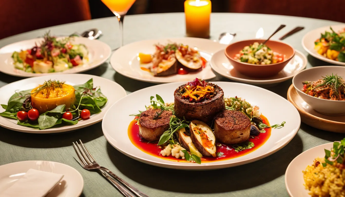
Visual appetite. High-quality food photography triggers a physiological hunger response that text alone cannot. A printed description of "Grilled Chicken Sandwich" doesn't make your mouth water. A 4K photo of that same sandwich with melting cheese and a toasted bun does. Digital boards let you pair every item with appetite-triggering visuals.
Reduced decision anxiety. A well-designed digital board uses visual hierarchy — size, color, position, and motion — to guide customers toward a decision. Instead of scanning 47 undifferentiated items on a printed poster, customers see 3-4 clearly featured options surrounded by supporting choices. Faster decisions mean shorter lines, higher throughput, and less order abandonment.
And that's not all: digital boards also eliminate the #1 customer complaint about menu boards. Industry surveys consistently show that the most frustrating experience for a customer is seeing an item on the menu, ordering it, and being told it's unavailable. With a POS-integrated digital board, sold-out items disappear from the screen automatically. No awkward conversations. No refunds. No negative reviews.
Layout Templates That Drive Sales
Menu board layout isn't about aesthetics — it's about directing attention to high-margin items. Here are three proven layout frameworks, each optimized for different restaurant types.
Template 1: The Zone Layout (Best for QSR and Fast Casual)
Divide your screen into 3-4 distinct zones:
- Hero Zone (top-left, 40% of screen): Your highest-margin combo or featured item. Large photo, large text, price prominently displayed. This is where the eye lands first.
- Category Zone (right side, 35%): Core menu items organized by category (burgers, chicken, sides). Smaller text, no photos needed here — the Hero Zone has already set the visual tone.
- Promotion Zone (bottom strip, 15%): Rotating promotions — loyalty program sign-up, gift card offers, limited-time specials. This zone uses gentle animation to cycle through 3-4 messages.
- Brand Zone (top strip, 10%): Logo, tagline, and Wi-Fi/social handles. Static — no animation here.
Rockin' Rolls Sushi Express uses this exact layout across their 3 locations with 49 iPad self-ordering stations. Their hero zone rotates between two premium rolls every 15 seconds, and their data shows the featured roll outsells comparable non-featured rolls by 3-to-1.
Template 2: The Daypart Grid (Best for Restaurants with Breakfast/Lunch/Dinner)
This layout is designed for automatic content switching throughout the day:
- Morning layout: Warm color palette (golds, soft oranges), coffee/breakfast combo hero, pastry add-on prompts.
- Lunch layout: Bright, energetic palette (reds, greens), combo meal hero with "Add a drink for $1.99" callout, speed-focused messaging ("Ready in 5 minutes").
- Dinner layout: Richer, deeper palette (burgundy, navy), shareable platter hero, beverage pairing suggestions, dessert spotlight.
The key insight: you're not just changing the items — you're changing the entire visual mood. A breakfast customer and a dinner customer are psychologically different people, even if they're the same human. Your board should reflect that shift.
Template 3: The Specialty Focus (Best for Bubble Tea, Coffee, Juice Bars)
Drink-focused concepts need a different approach because customization is the product:
- Base Drinks (left, 30%): Core menu items with starting prices.
- Customization Showcase (center, 40%): Large animated visual showing toppings, sweetness levels, ice options — making customization feel exciting rather than overwhelming.
- Seasonal Feature (right, 30%): Limited-time offering with countdown messaging ("Available through June 30").
Tiger Sugar runs this approach across their 2 stores with 2 self-service kiosks. Their seasonal drink features consistently achieve the highest attach rate of any menu category — partly because the animated visuals on the board create curiosity that drives customers to the kiosk screen to customize and order.
Animation Rules: What Moves, What Doesn't, and How Fast
Animation is where most digital menu boards go wrong. Restaurant owners either use no animation at all (defeating the purpose of going digital) or use so much motion that the screen looks like a Times Square billboard having a seizure.
Here's the thing: the right amount of animation is far less than you think.
The 3 Rules of Menu Board Animation
Rule 1: One motion zone at a time. Never animate more than one area of the screen simultaneously. If your hero zone is transitioning between featured items, your promotion zone should be static. When your promotion zone starts cycling, your hero zone should be still. Competing motion creates cognitive overload — the customer looks away entirely instead of focusing on either element.
Rule 2: 8-second minimum dwell time. Every piece of content should remain on screen for at least 8 seconds before transitioning. Restaurant industry data suggests that the average customer needs 5-7 seconds to read, process, and react to a menu board element. Faster transitions mean customers miss the message entirely and feel rushed.
Rule 3: Fade, don't fly. Gentle cross-fades between content (2-3 second transitions) outperform sliding, bouncing, or zooming animations. Aggressive animations trigger the brain's threat-detection system — the same instinct that makes you flinch when something moves quickly in your peripheral vision. That's the opposite of the relaxed, hungry feeling you want customers to have.
What to Animate (and What to Leave Static)
| Animate | Keep Static |
|---|---|
| Featured item hero photos (rotating 2-3 items) | Core menu items and prices |
| Promotion messages (gift card offers, loyalty sign-up) | Category headers and organization |
| Limited-time item spotlight | Logo and brand elements |
| Upsell prompts ("Make it a combo") | Allergen and nutrition info |
Notice that the static list is longer. Most of your board should not move. Animation is a seasoning, not the main course.
Dayparting: Automatic Menu Switching That Runs Itself
Dayparting is where digital boards deliver their most tangible operational benefit. Instead of a manager walking over to flip a switch or swap a poster at 11 AM, the board automatically transitions from breakfast to lunch content based on a schedule you set once.
But most restaurants stop at simply swapping items. Smart dayparting goes further.
Advanced Daypart Strategies
Price shifting. The same item can appear at different price points during different dayparts. A coffee that's $3.49 during morning rush might become part of a $9.99 "Afternoon Pick-Me-Up Combo" after 2 PM. Your POS handles the pricing; your board reflects it automatically.
Mood transitions. Beyond item changes, shift the entire visual language of the board. Morning boards should feel bright and efficient. Evening boards should feel warm and indulgent. This subconsciously signals to customers that the experience has changed, justifying different price points and portion expectations.
Promotion scheduling. Run happy hour specials only between 3-6 PM. Feature e-gift card promotions during the dinner rush when customers are most likely to think about gifting. Promote your loyalty program during off-peak hours when you want to incentivize return visits.
86'd item management. This is the dayparting feature that solves real operational pain. When your kitchen runs out of an item mid-service, the POS marks it as 86'd, and the digital board removes it instantly. No more customers ordering something that's unavailable. No more awkward conversations at the register. Shogun Japanese Hibachi implemented this across their 4 terminals with customized station displays, and their staff reported the single biggest reduction in customer complaints came from automated 86'd item removal on the boards.
With a platform like KwickOS, dayparting rules sync directly between your POS system and your KwickSign digital signage. Set it once, and the board runs itself — breakfast to lunch to dinner, with prices, photos, and promotions all changing automatically.
Content Design: What Goes on the Screen and How It Should Look
Even the best layout and animation strategy fails if the content itself is poorly designed. Here are the design principles that separate professional boards from amateur ones.
Typography
Maximum 3 font sizes. Item name (large), description (medium), price (large, bold). Every additional font size creates visual noise. Consistency signals professionalism and makes scanning faster.
Minimum 24pt from 10 feet. If a customer standing 10 feet away can't read the text, it's too small. Most digital menu boards are viewed from 8-15 feet. Test readability at actual viewing distance, not on your laptop screen.
High contrast only. White or light text on dark backgrounds, or dark text on light backgrounds. Never use medium-tone text on medium-tone backgrounds. Contrast matters even more on screens than on paper because of varying viewing angles and ambient light.
Photography
3-5 hero photos maximum. Not every item needs a photo. Feature photos only for the items you most want customers to order — your highest-margin offerings. Too many photos create visual clutter that dilutes the impact of each one.
Consistent style. All food photos should use the same lighting, angle, and styling. Mixed photography styles (one shot from above, one from the side, one with a dark background, one with a light background) look unprofessional and distract from the food.
No stock photos. Customers can detect stock photography instantly, and it destroys trust. If the burger on your board doesn't look like the burger they receive, you've created a negative experience before the first bite. Invest in a single professional photo shoot — or use the photography tips in our restaurant photography guide to shoot with your phone.
Pricing Display
Here's where the psychology gets interesting. Research consistently shows that removing dollar signs from prices reduces "price pain" — the negative emotional response triggered by spending money. On a digital board, display prices as clean numbers: 12.99 rather than $12.99.
Also, anchor your pricing visually. Place your highest-priced item (or combo) in the hero zone. When customers see a $14.99 premium combo first, the $9.99 regular combo feels like a value — even though $9.99 might have been the most expensive option on your old static board.
POS Integration: The Feature That Changes Everything
A digital menu board without POS integration is just a fancy television playing a slideshow. With POS integration, it becomes a dynamic sales tool that responds to your business in real-time.
Here's what true POS-to-board integration looks like:
- Price sync: Update a price in the POS, and it changes on every board across every location. No more price mismatches between what the customer sees and what they're charged.
- Item availability: Mark an item as 86'd in the kitchen, and it disappears from the board. Reinstate it when the next batch is ready.
- Promotion automation: Create a promotion in the POS (buy 2 entrees, get a free appetizer), and the board advertises it automatically during the scheduled window.
- Gift card and loyalty display: Rotate messages promoting e-gift card purchases and loyalty point balances during high-traffic dayparts. Crafty Crab Seafood uses their boards across 19 locations to promote gift cards during the dinner rush, with one-click menu sync ensuring every location displays the same promotion simultaneously.
- Multi-location management: Update once from a central dashboard, and all boards across all locations update simultaneously — or customize by location. T. Jin China Diner manages digital boards across 15 stores and 75 terminals from a single remote management interface, adjusting regional specials without visiting each location.
KwickOS provides this through its native KwickSign module. Because the POS and signage system share the same platform, there's no third-party middleware, no API delays, and no sync failures. Menu changes propagate to boards in under a second — fast enough to handle mid-service 86'd item updates without customers ever seeing a sold-out item.
Common Digital Menu Board Mistakes (And How to Fix Them)
After helping 5,000+ businesses across 50 states set up their technology stack, we see the same menu board mistakes repeatedly. Here are the top five, and how to fix each one.
Mistake 1: Too Many Items Per Screen
You're paying $3,800/year for processing fees you could reduce, but you're also losing revenue from boards that overwhelm customers. If your screen shows more than 24 items in a QSR or 12 items in a specialty shop, customers default to their usual order instead of exploring higher-margin options. The fix: use multiple screens (one per category) or a rotating content strategy that shows 15-20 items per view.
Mistake 2: Ignoring the Checkout Flow
Your digital board should work in concert with the rest of the customer journey, including the checkout process. If your board promotes a combo deal, your POS checkout screen should prompt the cashier or self-ordering kiosk to suggest that same combo. If your board advertises gift cards, your gift card display should be positioned near the register where the board directs the customer's attention. The board starts the conversation; the checkout completes it.
Mistake 3: Set-and-Forget Content
The board showing the same content for 6 months is only marginally better than a printed poster. Customers stop seeing it. Update your hero zone weekly — feature a new item, a seasonal special, or a limited-time promotion. Update your promotion zone daily with messages about today's specials, loyalty point multiplier events, or gift card bonuses.
Mistake 4: No Gift Card or Loyalty Visibility
Your digital board is the most-viewed surface in your restaurant, and you're not using it to promote your gift card program or loyalty sign-ups? That's revenue you're leaving untouched. Dedicate at least one rotation slot in your promotion zone to gift card messaging ("Give the gift of [Your Restaurant] — E-Gift Cards available at the register or online") and loyalty enrollment ("Join [Your Program], earn points on every visit — ask your server or scan to sign up").
Mistake 5: Consumer TVs Instead of Commercial Displays
A $400 consumer TV seems like a bargain compared to a $1,200 commercial display. But consumer TVs aren't designed for 16-hour daily operation, don't have the brightness to compete with restaurant lighting (300 nits vs 700+ nits for commercial), and typically fail within 12-18 months in a restaurant environment. Read our digital signage hardware guide for the full breakdown on choosing screens that survive a real restaurant.
Measuring Digital Menu Board ROI
You're investing in hardware, content design, and possibly a signage platform subscription. How do you know it's working?
Track these four metrics before and after your digital board launch:
- Average order value (AOV): The primary metric. Compare 30 days pre-launch to 30 days post-launch, controlling for seasonal variation. Industry benchmarks suggest a 15-23% increase in AOV within 60 days of a well-designed digital board launch.
- Featured item sales mix: Track the percentage of orders that include the item featured in your hero zone. If your hero zone is doing its job, that item should represent a measurably larger share of total sales.
- Upsell conversion rate: If your board promotes combos, track what percentage of customers upgrade from individual items to combos. A properly designed upsell prompt on a digital board typically converts 8-12% of individual orders to combos.
- Gift card and loyalty enrollment: Track gift card purchases and loyalty sign-ups before and after adding those promotions to your board rotation. Restaurants that add gift card messaging to their boards typically see a measurable increase in gift card revenue, especially during holiday seasons.
KwickOS generates all of these metrics automatically through its integrated POS and signage reporting. You can see the impact of specific board changes on sales data in real-time from the management dashboard — even from your phone using mobile reporting.
Getting Started: The 7-Day Digital Menu Board Launch Plan
You don't need to overthink this. Here's a practical 7-day plan to go from static poster to revenue-generating digital board:
Day 1-2: Hardware. Install your commercial display(s). If budget allows, use portrait orientation for a single-screen layout or landscape for multi-zone layouts. Connect to your POS network.
Day 3: Photography. Shoot your top 5 menu items using our phone photography guide. Natural light, consistent angle, clean background. These 5 photos will populate your hero zone rotation.
Day 4: Layout and Content. Build your zone layout using your signage platform. Set up categories, enter items and prices, position your hero photos. If you're on KwickOS, KwickSign pulls menu items directly from the POS — you're arranging, not re-entering data.
Day 5: Dayparting. Configure your daypart schedule. Set transition times, assign menu sets to each daypart, and test that transitions work correctly. Include at least one gift card rotation and one loyalty program message in your promotion zone.
Day 6: Animation. Add subtle fades to your hero zone (rotating every 10 seconds) and promotion zone (rotating every 15 seconds). Test from the customer's viewing position. If any animation feels distracting, slow it down or remove it.
Day 7: Launch and Baseline. Go live and record your baseline metrics (AOV, featured item sales, gift card activity). Compare at 30 and 60 days.
Total cost for a single-screen setup: $800-$1,500 for hardware, plus your POS platform's signage module (included with KwickOS at no additional cost through KwickSign). Compared to the $18,000+ in annual revenue lift that industry data suggests, the ROI timeline is measured in weeks, not months.
Turn Your Menu Board into a Revenue Engine
KwickOS includes KwickSign digital signage with real-time POS integration, dayparting, and multi-location management — all built in. See how it works for your business.
Compare KwickOS to Your Current POS