 Ming Ye
Open your menu right now. Look at it the way a first-time customer would — someone who has never been to your restaurant and has about 109 seconds before their server comes back for the order.
What do their eyes land on first? The cheapest pasta? The specials box that is crammed into a corner? The $42 steak that is buried under three paragraphs of description nobody reads?
Here's the thing: where their eyes go is where their money goes. And the fonts, colors, spacing, and layout on your menu control exactly where those eyes land.
Industry research suggests that menu engineering — the science of designing menus to maximize profitability — can increase average check size by 10-15% without changing a single recipe, ingredient, or price. On a restaurant doing $80,000/month in revenue, that is $8,000 to $12,000 in additional monthly revenue from a piece of paper.
But it gets worse: most restaurant owners design their menus the same way they have for 20 years. A Word document. Comic Sans or Times New Roman. Dollar signs with two decimal places. Items listed cheapest to most expensive. Every design mistake in the book, repeated on a laminated sheet that silently kills profit margins every single shift.
This guide breaks down the typography, layout, color, and psychological principles that separate a menu that sells from a menu that just lists food.
Typography: The Font Choices That Shape Perception
Your font does not just make words readable. It tells customers what kind of restaurant they are in and how much they should expect to spend — before they read a single word.
Serif vs. Sans-Serif: The $4 Difference Per Check
Restaurant industry data consistently shows that serif fonts (the ones with small decorative strokes at the end of letters — think Garamond, Baskerville, Playfair Display) signal sophistication, tradition, and quality. Sans-serif fonts (clean, modern, no strokes — think Helvetica, Inter, Montserrat) signal efficiency, speed, and casual dining.
Neither is inherently better. The question is whether your font matches your price point:
- Fine dining and upscale casual ($25+ entrees): Serif fonts for dish names and descriptions. They slow the reader down, encourage savoring, and create a premium perception. Garamond, Cormorant, or EB Garamond work beautifully.
- Fast casual and QSR ($8-15 entrees): Sans-serif fonts for speed and clarity. Customers are making fast decisions and need to scan quickly. Inter, Lato, or Open Sans are clean and efficient.
- Casual dining ($15-25 entrees): A hybrid approach — serif for dish names, sans-serif for descriptions and prices. This creates visual hierarchy while maintaining readability.
And that's not all: the weight (thickness) of your font matters too. Bold dish names with lighter descriptions create natural emphasis. When everything is the same weight, nothing stands out — and customers default to scanning by price, which always leads them to the cheapest option.
Drop the Dollar Sign (Seriously)
This is the single easiest change you can make today. According to restaurant industry data, removing the dollar sign from menu prices reduces the psychological "pain of paying" and increases average spending by 8-12%.
Instead of $18.00, write 18.
Instead of $24.95, write 24.
The dollar sign activates the part of the brain associated with cost evaluation. Without it, the number becomes abstract — just a figure, not a price. The same principle explains why removing decimals works: "$18.00" feels more expensive than "18" even though they represent the same amount.
This applies to printed menus, digital POS displays, self-ordering kiosks, and online ordering platforms alike. If your POS system controls what customers see on a kiosk or customer-facing display, make sure the price formatting matches this principle. KwickOS lets you customize price display format across all touchpoints — printed, kiosk, and online — from a single menu management dashboard.
Font Size Hierarchy: Guide the Eye
Your menu should have exactly three font sizes:
- Section headers (14-18pt): "Appetizers," "Entrees," "Desserts" — bold, clear, scannable.
- Dish names (11-13pt): The star of the show. Bold or semi-bold. This is what you want customers reading first.
- Descriptions (9-10pt): Supporting detail. Regular weight, slightly lighter color if possible. Keeps the focus on the dish name while providing just enough detail to sell.
Here's the thing: if your prices are the same size as your dish names, you are telling customers that cost is as important as what they are eating. Make prices slightly smaller (9-10pt), align them to the right, and never use leader dots (....) connecting the dish name to the price. Those dots create a price-comparison highway that trains the eye to compare costs instead of reading descriptions.
Layout: Where Items Sit Determines What Sells
Menu layout is not about fitting as many items as possible onto a page. It is about controlling the visual path your customer takes through your most profitable offerings.
The Golden Triangle and the Sweet Spot
Eye-tracking studies in the hospitality industry reveal that on a two-panel menu, customers look at three areas first: the middle of the right panel, the top of the right panel, and the top of the left panel — forming a "golden triangle." On a single-page menu, the center and top-right corner get the most attention.
This means your highest-margin items should live in these spots. Not your cheapest dishes. Not your most expensive (which can trigger sticker shock). Your stars — the items that are both popular and profitable.
Use your POS sales mix data to identify which items fall into which category:
- Stars: High popularity + high profit margin. Put these in the golden triangle. Highlight them with boxes, bold text, or icons.
- Plow horses: High popularity + low margin. Keep them on the menu but do not give them prime real estate. Consider raising their price slightly.
- Puzzles: Low popularity + high margin. Move them to better positions, improve their descriptions, add photos. These are your hidden money-makers.
- Dogs: Low popularity + low margin. Remove them or reinvent them. Every dog on your menu dilutes attention from items that actually make money.
Crafty Crab Seafood, which operates 19 locations with 152 terminals on KwickOS, uses centralized menu management to A/B test item placement across locations. When they moved their highest-margin seafood combo from the bottom of the entrees section to the golden triangle position with a chef's recommendation icon, that single item's sales increased 28% across all stores within two weeks — synchronized with one click from their central menu dashboard.
The Decoy Effect: Strategic Price Anchoring
Place a high-priced "anchor" item at the top of each section. A $48 ribeye at the top of your entrees list makes the $28 salmon directly below it feel like a reasonable choice — even though the salmon has a 72% food cost margin and is the item you actually want to sell.
This is not about tricking customers. It is about context. Without an anchor, $28 feels expensive. Next to $48, it feels smart.
But it gets worse for restaurants that list items from cheapest to most expensive: customers scan down until they find something "affordable enough" and stop reading. You have just trained them to pick the cheapest item on your menu. Always break price order. Scatter prices. Let descriptions and positioning — not ascending dollar amounts — guide the decision.
White Space Is Not Wasted Space
The instinct to cram more items into less space is one of the most expensive mistakes in menu design. Cluttered menus overwhelm customers, slow down ordering (which hurts table turnover), and push diners toward "safe" choices — usually the cheapest familiar item.
Leave generous margins. Use spacing between sections. Give star items breathing room with a subtle box or background tint. A menu with 30 well-presented items will outsell a menu with 60 crammed items every single time.
Restaurants that have trimmed their menu from 50+ items to 30-35 focused offerings consistently see average check increases and faster kitchen ticket times — Shogun Japanese Hibachi customized their KDS station displays specifically around a focused menu, and new staff reach full proficiency in under 5 minutes because there is less to memorize.
Color Psychology: Appetite, Attention, and Action
Color on a menu is not decoration. It is a behavioral trigger.
- Red and orange: Stimulate appetite and create urgency. Use for call-out boxes around high-margin items, "New" badges, and limited-time offers. Red draws the eye faster than any other color.
- Green: Signals freshness, health, and natural ingredients. Ideal for salad sections, vegetarian options, and farm-to-table messaging.
- Dark backgrounds (black, navy, dark gray) with light text: Create a premium, upscale feel. Every fine-dining restaurant in the world uses this for a reason — dark menus slow people down and signal that they are in a special place.
- Blue: Suppresses appetite. It is the rarest color in natural food, and your brain knows it. Avoid blue backgrounds, blue text, and blue accents anywhere near food items.
- Gold and copper accents: Signal luxury and premium quality. A gold border around your chef's selection or a copper-colored section header creates subconscious value association.
And that's not all — color consistency between your physical menu and your digital presence matters enormously. When a customer sees one color scheme on your printed menu, a different scheme on your online ordering platform, and yet another on your kiosk screen, it creates brand fragmentation that erodes trust. KwickOS digital signage (KwickSign) and self-ordering kiosks pull directly from the same menu database, maintaining consistent branding across every touchpoint.
Descriptions: Words That Sell vs. Words That Sit
A menu description is a 15-word sales pitch. Most restaurants waste it.
The Formula That Works
Effective menu descriptions follow a pattern: cooking method + key ingredient + sensory adjective + origin or story.
- Bad: "Grilled salmon with vegetables and rice."
- Good: "Wood-grilled Atlantic salmon, crispy broccolini, jasmine rice, citrus beurre blanc."
The second description uses sensory language (wood-grilled, crispy, citrus), specific ingredients (Atlantic salmon, broccolini, jasmine rice), and a technique reference (beurre blanc) that signals expertise. It paints a picture. It makes the reader taste the dish before ordering.
According to restaurant industry data, descriptive menu labels increase sales of individual items by up to 27% compared to plain names. "Grandma's Homestyle Chicken Pot Pie" outsells "Chicken Pot Pie" even when the recipe is identical.
Description Length: The 2-Line Rule
Keep descriptions to two lines maximum. Research suggests that customers spend an average of 109 seconds scanning a menu. That is less than two minutes to read 30+ items, make a decision, and close the menu. Long descriptions do not get read — they get skipped, and the dish gets ignored.
Two lines. Every word has to earn its place.
Photos: When They Help and When They Hurt
Here is where most restaurant owners get it wrong — they either use no photos or use too many bad ones.
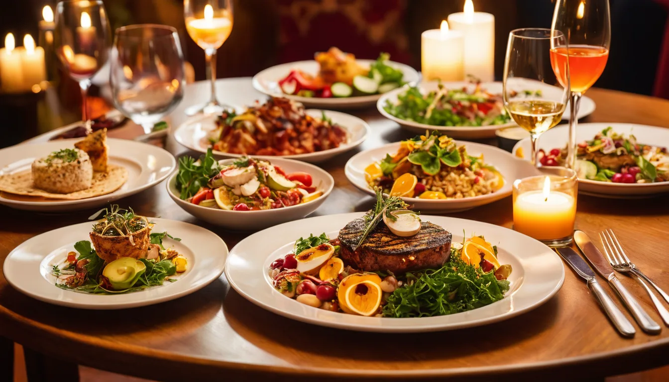
For printed menus: Use 4-6 high-quality, professionally styled photos of your absolute best dishes. Photos of mediocre or poorly lit food make your restaurant look cheap. If you cannot afford professional photography, smartphone photos with proper lighting and basic editing can work — but limit them to your star items only.
For digital menus, kiosks, and online ordering: Every single item should have a photo. This is non-negotiable. Items with photos on digital ordering platforms see 30-40% higher order rates. Customers browsing a screen behave differently than customers reading a physical menu — they want visual confirmation of what they are ordering.
Tiger Sugar uses just 2 self-ordering kiosks across 2 locations, and every bubble tea variation has a photo with a minimal-step customization flow. The visual-first approach means customers spend less time deciding and more time customizing (adding toppings, upsizing, choosing sugar levels) — which is where the margin lives. Their e-gift cards display the same vibrant product photography, making gift purchases feel premium.
KwickMenu (kwickmenu.com) automatically formats menu photos for every platform — print, kiosk, online ordering, and digital signage — from a single upload. One photo, consistent across every customer touchpoint.
Gift Cards, Loyalty, and Menu Design: The Connection Most Miss
Your menu is not just where customers decide what to eat. It is where you plant the seeds for repeat visits and higher lifetime value.
Gift card callouts on the menu: Add a small, tasteful mention of gift cards at the bottom of your menu or inside the dessert section (where customers are already in a "treat yourself" mindset). "Give the Gift of [Restaurant Name] — E-Gift Cards Available" with a QR code linking to your gift card purchase page turns every dine-in customer into a potential gift card buyer. Industry data shows that gift card redemptions average 20-40% above the card value — meaning a $50 gift card generates $60-70 in actual revenue.
Loyalty program integration: Include a small loyalty badge or "Members save 10%" icon next to 2-3 menu items. This does two things: it reminds existing members to scan their loyalty card at checkout, and it creates curiosity in non-members who see other people getting a deal. KwickOS loyalty and membership programs let you customize which items earn bonus points, creating a direct connection between your menu design and your repeat-visit strategy.
Points multiplier callouts: "Earn 2X Points on Any Appetizer This Month" printed on a menu insert or displayed on your digital signage turns your points program into a menu engineering tool — driving orders toward high-margin appetizers while rewarding loyalty simultaneously.
The Digital Menu Advantage
Everything we have discussed — typography, layout, color, descriptions, photos — applies to both physical and digital menus. But digital menus on POS systems, kiosks, and online ordering platforms have one massive advantage: you can change them instantly.
Want to test whether moving your salmon from position 4 to position 1 increases orders? On a printed menu, that means a reprint. On KwickOS, it takes 30 seconds and syncs across every location. Want to add a "Chef's Pick" badge to push a high-margin special? One click.
Crafty Crab runs menu experiments across their 19 locations continuously — testing descriptions, photo styles, item positions, and pricing across different stores, then rolling the winning configuration everywhere. That is the kind of data-driven menu engineering that was impossible with printed menus and manual updates.
Rockin' Rolls Sushi Express uses 49 iPad self-ordering stations across 3 locations, and every screen reflects real-time menu changes. When a roll sells out, it disappears instantly. When a new seasonal roll launches, it appears in the golden triangle position across all 49 screens simultaneously — with photos, descriptions, and loyalty point multipliers already configured.
The Checkout Connection: From Menu to Register
Menu design does not end when the customer closes the menu. The POS checkout flow is the last opportunity to apply these same psychological principles.
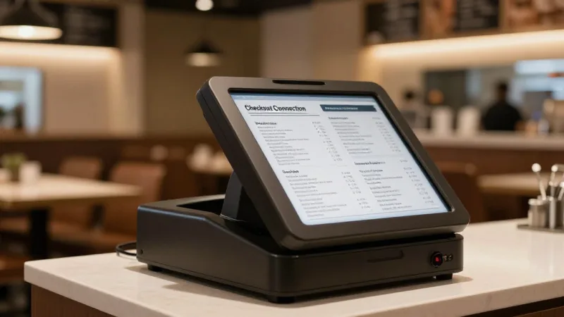
During checkout, your POS system can prompt servers or kiosk screens with:
- Modifier upsells: "Add truffle oil? +3" — using the same no-dollar-sign formatting as your menu.
- Dessert suggestions: A photo-driven dessert prompt on the customer-facing display, timed to appear after the entree is rung up.
- Gift card prompt: "Would you like to add a $25 e-gift card for someone special?" — especially effective during November and December when gift card purchases spike.
- Loyalty enrollment: "Earn points on today's order? Join in 10 seconds" — with a simple phone number entry on the POS terminal.
The visual language at checkout should mirror the visual language on your menu: same fonts, same colors, same photography style. KwickOS maintains this consistency automatically because your POS, kiosk, online ordering, and digital signage all pull from the same design system.
Your Menu Redesign Checklist
Before you spend a dollar on a menu redesign, run through this list. Every item is backed by the principles in this article:
- Remove dollar signs and decimal points from all prices.
- Use serif fonts for dish names if your average entree is $20+.
- Place your 3 highest-margin items in the golden triangle (center-right of the menu).
- Add a high-priced anchor item at the top of each section.
- Break price order — never list items cheapest to most expensive.
- Cut menu to 30-35 items maximum. Remove every "dog" (low popularity + low margin).
- Rewrite descriptions using the cooking method + ingredient + sensory adjective formula.
- Limit printed menu photos to 4-6 professional-quality images of star items.
- Add a gift card callout with QR code in the dessert section.
- Include 2-3 loyalty point multiplier badges on high-margin items.
- Add generous white space between sections and around star items.
- Use red/orange accent colors to highlight specials and high-margin items.
Use your POS sales mix report (KwickOS generates these automatically under Reports > Menu Analysis) to identify your stars, plow horses, puzzles, and dogs before starting the redesign. Data first, design second.
Want to see how your current menu stacks up against these principles? Our menu engineering calculator helps you categorize every item by popularity and profitability, so you know exactly what to highlight, reposition, or remove.
Design Menus That Sell — Across Every Screen
KwickOS unifies your printed menu, digital signage, self-ordering kiosks, and online ordering into one system. Change a dish name, photo, or price once — it updates everywhere in seconds.
See KwickOS Menu Management