 Tom Jin
You spent $3,000 on a self-ordering kiosk. You loaded your menu. You waited for the magic to happen.
And the average ticket went up... maybe $1.50.
Meanwhile, the kiosk at the bubble tea shop down the street is pulling $4.27 more per order than their counter. The fast-casual place across town reports 23% higher tickets from kiosk orders versus cashier orders. And you are staring at your screen wondering what they know that you don't.
Here's the thing: the difference isn't the hardware. It's the menu design. The same kiosk running two different menu layouts will produce wildly different revenue. One design lets customers order. The other design makes customers want to order more.
After deploying kiosks across thousands of restaurants — from Tiger Sugar's 2-store bubble tea operation to Rockin' Rolls' 49 iPad self-ordering stations across 3 locations — I've watched the same patterns repeat. The operators who treat their kiosk menu like a digital version of their paper menu leave money on the table. The operators who understand the psychology of screen-based ordering see their average ticket climb 20-30% within the first month.
This guide breaks down every psychological principle that separates a kiosk that takes orders from a kiosk that sells. You will learn exactly what to change, why it works, and how much each change is worth in actual dollars.
Why Customers Spend More at Kiosks (and How to Amplify It)
Before we get into specific design tactics, you need to understand why kiosks produce higher tickets in the first place. It's not because customers are bad at math. It's because three psychological forces converge on a screen that don't exist at a counter.
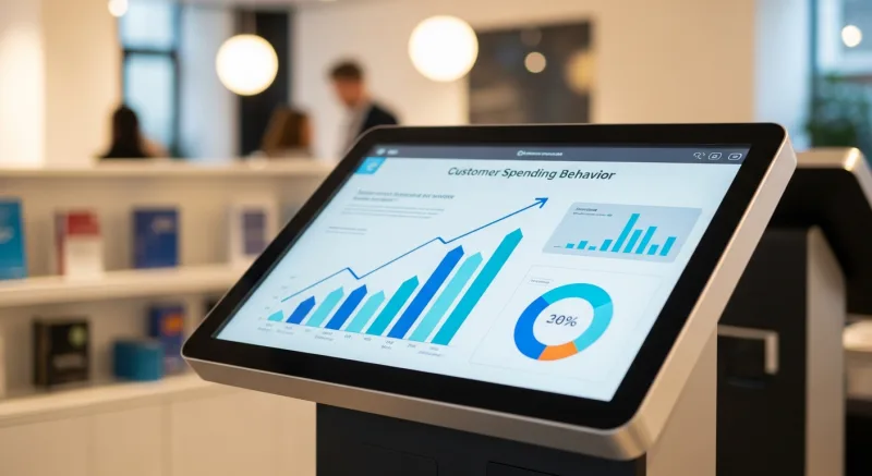
Force 1: The absence of social judgment. When a customer orders from a cashier, there's a subtle social pressure to order quickly, not seem indecisive, and not "overdo it." That pressure disappears at a kiosk. Nobody is watching. Nobody is judging. So the customer who would never say "add extra cheese, extra bacon, and a large shake" to a person's face will tap those buttons without hesitation.
Force 2: Visual persuasion. A cashier describes a burger with words. A kiosk shows a burger with a photo. The photo activates the ventromedial prefrontal cortex — the brain region responsible for desire and reward anticipation. A well-photographed burger triggers a craving response that no verbal description can match. Items with professional photos sell 30-40% more than text-only listings on kiosk screens.
Force 3: Structured decision architecture. At a counter, modifiers and add-ons depend on the cashier remembering to ask. "Would you like to add bacon?" "Want to make it a combo?" Most cashiers forget or skip these prompts during rush hour. A kiosk never forgets. Every single order gets every single upsell prompt, presented at the exact moment the customer is most likely to say yes.
But it gets worse: most kiosk operators are only capturing a fraction of this potential. The default menu layouts that come with most kiosk software are designed for functionality, not psychology. They display your items clearly and process orders correctly — but they don't sell.
Here's what a psychologically optimized kiosk menu does differently.
The Category Screen: Where 60% of Revenue Decisions Are Made
The first screen your customer sees after "Start Order" determines 60% of their total spend. Not the item screen. Not the modifier screen. The category screen.
Why? Because category selection is where the customer decides their mental budget. If they tap "Value Menu," they've mentally committed to spending $6-8. If they tap "Signature Combos," they've committed to $12-16. The category they choose anchors every subsequent decision.
And that's not all: most kiosk operators organize categories the way they organize their kitchen — by food type. Burgers. Chicken. Sides. Drinks. This is logical but psychologically wrong.
Here's how to restructure your categories for maximum ticket size:
- Lead with combos and meals, not individual items. Your first category should be "Meals" or "Combos" or "Chef's Picks" — not "Burgers." When the first option is a complete meal at $13.99, it sets the anchor high. Customers who might have ordered a $7.99 burger alone now see that as the cheap option.
- Limit categories to 5-7. More than 7 categories creates decision fatigue. Customers default to the first familiar category and stop exploring. Fewer categories means more browsing, which means more exposure to high-margin items.
- Name categories with desire, not description. "Fan Favorites" outperforms "Popular Items." "Fresh & Crispy" outperforms "Fried." "Made for You" outperforms "Customizable." The category name should create anticipation, not just navigate.
- Use category images that show the best item in the category, not a collage. A single stunning photo of your signature combo pulls more taps than a grid of four smaller photos. One strong image beats four weak ones.
Tiger Sugar's 2-store kiosk operation demonstrates this perfectly. Their category screen doesn't start with "Drinks." It starts with "Most Loved" — a curated selection of 6 signature items with the highest margins. Customers who tap "Most Loved" spend an average of $2.80 more per order than customers who navigate through the standard drink categories.
The Item Grid: Visual Hierarchy That Guides the Eye
Once a customer is inside a category, you have approximately 3 seconds before their eyes lock onto an item. Where they look first is not random — it follows a predictable pattern that you can engineer.
On a vertical kiosk screen, eye tracking studies show that customers look at the top-left item first, then scan right, then drop to the second row. The bottom-right item gets the least attention. This is the F-pattern, and it's consistent across cultures and age groups.
What this means for your menu:
| Screen Position | What to Place Here | Why |
|---|---|---|
| Top-left | Highest-margin item | Gets 38% more views than bottom-right |
| Top-right | Second highest-margin item | Second most viewed position |
| Center | Best seller (social proof anchor) | Validates the customer's browsing — "others buy this too" |
| Bottom-left | New or seasonal item | Gets moderate attention, curiosity drives taps |
| Bottom-right | Value item | Least viewed — put your lowest-margin item here |
Here's a critical mistake I see constantly: putting items in alphabetical order. Alphabetical order is the enemy of margin optimization. It places items by name, not by profitability. Your "Avocado Burger" at $14.99 ends up in the prime top-left position while your $16.99 "Wagyu Smash" is buried at the bottom.
Limit each screen to 6-8 items. The paradox of choice is real on kiosks — when customers see 15 items on a single screen, they take longer to decide, feel less satisfied with their choice, and are less likely to add modifications. Six items on a screen produces 22% more add-ons than twelve items on the same screen.
The Photo Effect: 30% More Sales Per Pixel
You already know that food photos matter. But do you know how much? And do you know that bad photos are worse than no photos at all?
Here are the numbers from real kiosk deployments:
| Photo Quality | Sales Impact vs Text-Only |
|---|---|
| Professional photo (studio lighting, styled) | +38% sales |
| Good smartphone photo (natural light, clean plate) | +24% sales |
| Average smartphone photo (dim, cluttered background) | +5% sales |
| Bad photo (blurry, wrong colors, old dish) | -15% sales |
Read that last line again. A bad photo actively drives customers away from an item. If you cannot get at least a decent smartphone photo of a menu item, leave it as text-only. You'll sell more.
But it gets worse: most operators photograph their entire menu once and never update the images. Seasonal items get recycled photos from last year. New dishes launch with no photos. The kiosk gradually becomes a mix of polished and amateur images, which makes the entire experience feel inconsistent.
The fix is straightforward. Shoot your top 20 items with good lighting and a clean background. These 20 items likely represent 70-80% of your kiosk sales. For everything else, use clean text descriptions with a consistent placeholder style. Consistency beats coverage.
The Modifier Screen: Where the Real Money Is
A customer just tapped "Classic Burger — $9.99." What happens next determines whether that order stays at $9.99 or climbs to $13.47.
The modifier screen is the single most valuable screen in your entire kiosk flow. This is where bacon gets added ($1.99), cheese gets upgraded ($0.99), sizes get bumped ($1.50), and drinks get attached ($2.99). On average, a well-designed modifier flow adds $3.00-$4.50 to every order.
And that's not all: most kiosks present modifiers as a checklist. A flat list of 12 options in small text, all unchecked, with a "Continue" button at the bottom. This is the laziest possible implementation and it captures maybe 40% of available upsell revenue.
Here's what a psychologically optimized modifier screen looks like:
Pre-select the most popular option. Instead of showing an empty checkbox for "Add Cheese — $0.99," show cheese as already selected with a checkmark. The customer now has to actively remove it rather than actively add it. This single change — known as default bias — increases modifier attachment rates by 30-45%. Customers who would never bother to add cheese will leave it selected because removing it feels like losing something.
Use "Most Popular" badges on the top 2-3 modifiers. Social proof works on modifier screens just as well as it works on item screens. When a customer sees "Most Popular" next to "Add Avocado — $1.99," it validates the decision to spend more. "Everyone else is doing it" is one of the most powerful purchase triggers in psychology.
Group modifiers by decision type, not by price. Don't show all modifiers in one list sorted by cost. Instead, break them into micro-decisions: "Customize Your Protein" (screen 1), "Add Toppings" (screen 2), "Make It a Meal" (screen 3). Each screen is a small, easy yes-or-no decision. Small decisions feel painless. A $4.48 total add-on spread across three easy screens feels lighter than a $4.48 add-on on one screen.
But limit modifier screens to 2-3 maximum. One modifier screen captures 85% of available upsells. Two screens capture 93%. Three screens capture 96%. Beyond three, you start losing customers to frustration. The abandon rate spikes after the fourth modifier screen. More screens doesn't mean more revenue — it means more abandoned orders.
The Combo Suggestion: Anchoring and Bundling
After modifiers, the next highest-value screen is the combo or bundle suggestion. This is where you transform a $9.99 burger into a $14.49 meal.
The psychology here is anchoring. When you show a customer their burger at $9.99 and then offer "Make It a Meal: add fries + drink for $4.50," the customer compares the $4.50 against the $9.99 they've already committed to — not against what fries and a drink cost individually. The $4.50 feels like a small addition, even though it's a 45% increase to their order.
Here's how to structure the combo suggestion for maximum conversion:
- Show the savings, not just the price. "Add fries + drink for $4.50 (Save $2.48)" converts 34% better than "Add fries + drink for $4.50." The perceived discount creates urgency — skipping the combo now feels like losing $2.48.
- Offer exactly 3 combo tiers. Good, Better, Best. The middle option should be your target — it will be chosen 62% of the time due to the compromise effect. Price the bottom tier too low to feel like a deal, and the top tier high enough to make the middle feel reasonable.
- Use photos of the complete combo, not the add-ons. A photo of a burger, fries, and drink together looks like a complete meal. A photo of just fries and a drink looks like an add-on expense. The visual framing changes the perception from "spending more" to "getting a meal."
Rockin' Rolls Sushi Express runs 49 iPad kiosk stations across 3 locations. Their combo suggestion screen shows three tiers: "Just the Roll" ($10.99), "Roll + Miso + Drink" ($14.49), and "Roll + 2 Sides + Drink + Dessert" ($18.99). The middle tier captures 58% of orders. Before adding tiered combos, 71% of customers ordered individual rolls only.
The Checkout Flow: Last Chance to Add $2
The checkout screen is where most kiosk operators give up on upselling. The customer has built their order, they're ready to pay, and the kiosk shows a simple order summary with a "Pay Now" button.
This is a mistake. The checkout screen is your last — and often most effective — upsell opportunity. The customer is already committed. Their wallet is mentally open. And the psychological principle of commitment consistency means they're more likely to add a small item now than they were at the beginning of the order.
Here's the thing: the checkout upsell has to be small. This is not the place to suggest a $12 entree. This is the place for:
- A dessert or treat ($2.99-$4.99). "Complete your meal with a fresh-baked cookie?" converts at 18-22% on kiosks. That's $0.54-$1.10 per transaction in pure add-on revenue.
- A drink upgrade ($0.99-$1.50). "Upgrade to a large for $0.99?" converts at 28-35%. Almost one in three customers will tap yes because $0.99 feels insignificant when they're about to pay $14.
- A loyalty enrollment. "Earn points on this order?" captures email addresses and increases return visit rates by 23%. Not an immediate revenue boost, but a long-term multiplier.
Baked Cravings operates a self-serve kiosk at Lego Land that demonstrates this perfectly. Their checkout screen suggests one featured item — a rotating daily special dessert. Because the kiosk is in a high-traffic tourist location where customers are already in a spending mindset, that single checkout prompt converts at 31% and adds an average of $3.75 to orders that accept it.
The Tip Screen: Psychology of Generosity
The tip screen is where kiosk psychology gets controversial — and profitable. Digital tip prompts on kiosks produce 15-25% higher tip rates than tip jars or verbal requests. The reason is simple: it's harder to tap "$0.00" on a screen than it is to walk past a jar.
Optimizing the tip screen:
- Pre-set three percentage options: 15%, 20%, 25%. The middle option (20%) will be selected most often due to compromise effect. Starting at 15% instead of 10% anchors the "minimum" higher.
- Show dollar amounts alongside percentages. "20% ($2.90)" feels more concrete and less painful than just "20%." Customers process dollar amounts faster than percentages.
- Place the "No Tip" option as text, not a button. Make it a small link below the percentage buttons, not a fourth button of equal size. This isn't about hiding the option — it's about visual weight. The tip buttons should dominate the screen.
- Add a brief message. "Tips go directly to our team" increases tip rates by 12% compared to a bare tip screen. Customers tip people, not businesses.
Speed vs Revenue: Finding the Sweet Spot
There's a tension at the heart of kiosk design: every additional screen increases average ticket but also increases time-per-order. During a lunch rush, a kiosk that takes 3 minutes per order serves 20 customers per hour. A kiosk that takes 4 minutes per order serves 15 customers per hour.
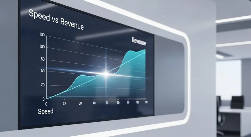
If the extra minute adds $3 per order but you lose 5 customers, you've traded $15 in revenue (5 lost customers x $12 average) for $60 in upsells (20 orders x $3). That's a net gain of $45 per hour. Worth it.
But if the extra minute adds $1.50 per order and you lose 5 customers, you've traded $60 for $30. Net loss of $30 per hour. Not worth it.
The formula is straightforward:
If (upsell per order × orders served with extra screen) > (average ticket × customers lost due to longer wait), add the screen.
In practice, 2-3 modifier screens and 1 combo suggestion screen is the sweet spot for most restaurants. The total kiosk order time should stay under 2 minutes for quick-service and under 3 minutes for fast-casual. Beyond that, you're creating a bottleneck that costs more than the upsells generate.
Shogun Japanese Hibachi found this balance with their custom KDS and kiosk setup — operators were proficient within 5 minutes, and order times averaged 1:45 for a full customized hibachi order with 3 modifier screens. The key was reducing friction everywhere else (fast photo loading, responsive touch, instant payment processing) so the modifier screens didn't feel slow.
The Numbers: What a Psychologically Optimized Kiosk Is Worth
Let's put real numbers on each optimization for a restaurant doing 200 kiosk orders per day at a $12 average ticket:
| Optimization | Avg Ticket Increase | Daily Revenue | Annual Revenue |
|---|---|---|---|
| Category restructuring (combos first) | +$0.85 | +$170 | +$62,050 |
| Visual hierarchy (margin items in prime position) | +$0.45 | +$90 | +$32,850 |
| Professional food photos (top 20 items) | +$0.60 | +$120 | +$43,800 |
| Pre-selected modifiers + social proof | +$1.20 | +$240 | +$87,600 |
| Tiered combo suggestion | +$0.90 | +$180 | +$65,700 |
| Checkout upsell (dessert/upgrade) | +$0.55 | +$110 | +$40,150 |
| Total potential | +$4.55 | +$910 | +$332,150 |
You won't capture 100% of this potential — some optimizations interact and their effects overlap. A realistic estimate is 60-70% of the theoretical maximum, which means $199,000-$232,000 in additional annual revenue from menu psychology changes alone. No new equipment. No new staff. No new recipes. Just better screen design.
For a single-location restaurant, even capturing half of this — $100,000/year — transforms the economics of the business. On 5% net margins, that's the profit equivalent of generating $2,000,000 in additional traditional revenue.
Implementation Checklist: 7 Changes This Week
You don't need to overhaul your entire kiosk overnight. Start with the highest-impact changes and measure the results before moving on:
- Restructure your category screen. Move "Combos" or "Meals" to the first position. Rename categories for desire, not description. This takes 15 minutes in your kiosk admin and should increase average ticket by $0.85 within the first week.
- Pre-select your top 3 modifiers. Choose the most popular add-ons that are currently at 20-40% attachment rate and make them default-on. Expected increase: $1.20 per order. This is the single highest-ROI change you can make.
- Add 3-tier combo suggestions. Create Good/Better/Best bundles for your top 5 items. Price the middle tier at the sweet spot where it feels like an obvious deal. Expected increase: $0.90 per order.
- Photograph your top 10 items. Use a smartphone with natural light, a clean white or dark surface, and a 45-degree angle. Replace whatever images are currently on those items. This alone can drive a 24% sales increase on photographed items.
- Rearrange item positions by margin, not alphabetically. Put your highest-margin item in the top-left of every category grid. Takes 10 minutes.
- Add one checkout upsell. Pick your best dessert or most popular add-on and put it on the order review screen. A single "Add a cookie for $2.99?" prompt at checkout converts at 18-22%.
- Optimize your tip screen. Set pre-sets to 15%/20%/25% with dollar amounts shown. Add "Tips go directly to our team."
Track your average ticket daily for two weeks after implementing. Compare against your two-week baseline before changes. The results should be visible within the first 3-4 days.
Want to calculate exactly what these changes could mean for your specific operation? Use our kiosk ROI calculator to plug in your numbers. And if you're comparing kiosk-capable POS systems, our KwickOS vs Toast comparison breaks down which platforms give you full control over kiosk menu design — because the best psychology in the world is useless if your POS vendor locks you into their default layout.
The restaurant industry is moving rapidly toward self-service. The operators who master kiosk menu psychology now will have a permanent revenue advantage over those who treat their kiosks like digital cash registers. The screen is not just a tool for taking orders. It's your best salesperson — if you design it that way.
Build a Kiosk That Sells, Not Just Takes Orders
KwickOS kiosks give you full control over menu layout, modifier flows, combo suggestions, and checkout upsells — with no locked templates. Design the psychology that matches your menu.
Get a Demo